Read Seattle
Read Seattle is a community-driven literacy movement connecting volunteers, families, and educators across the city. By linking willing readers with trusted nonprofits and local schools, they make it possible for every child in Seattle to discover the joy and confidence of reading.
Branding, illustration, Website design & Creation
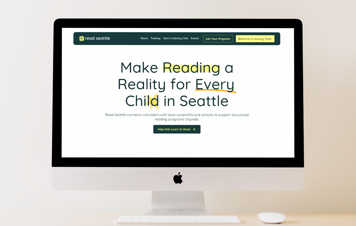
Bringing Clarity to a Fragmented Effort
Despite the urgency of the literacy gap in Seattle—where far too many children struggle with reading—many volunteering opportunities remained fragmented and hard to access. The challenge was to build a unified brand and digital experience that could rally the community, simplify how volunteers engage, and clearly communicate the city-wide impact of reading support.
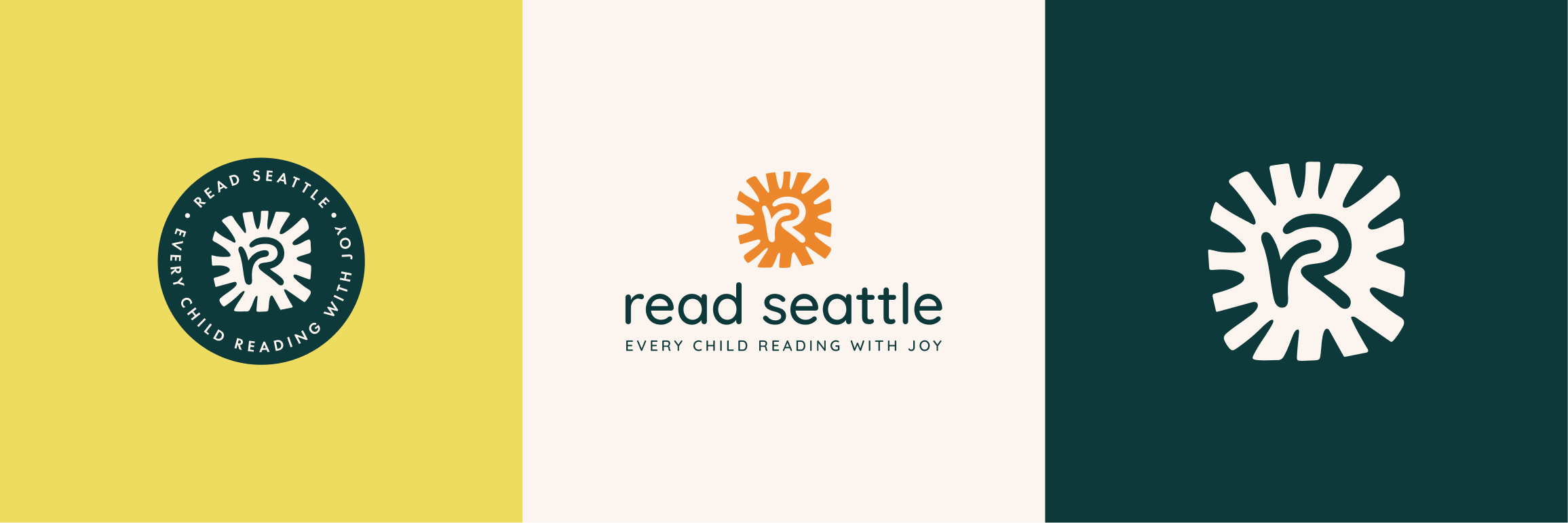
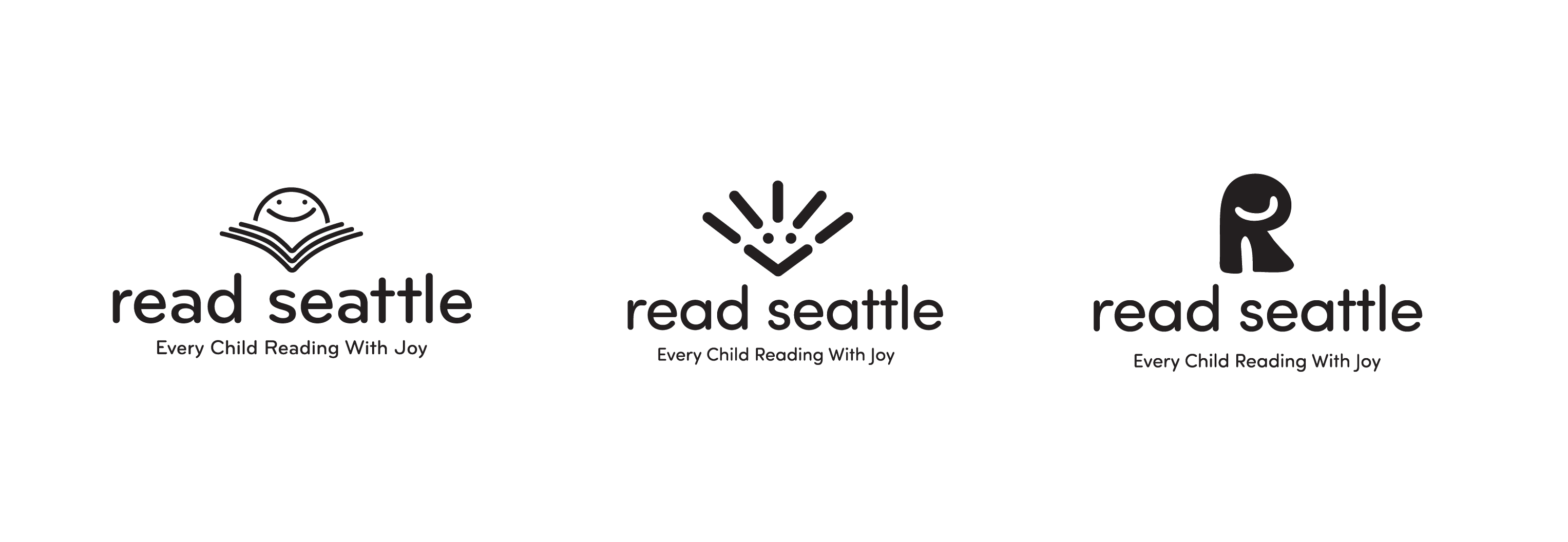
From Little r to Big R.
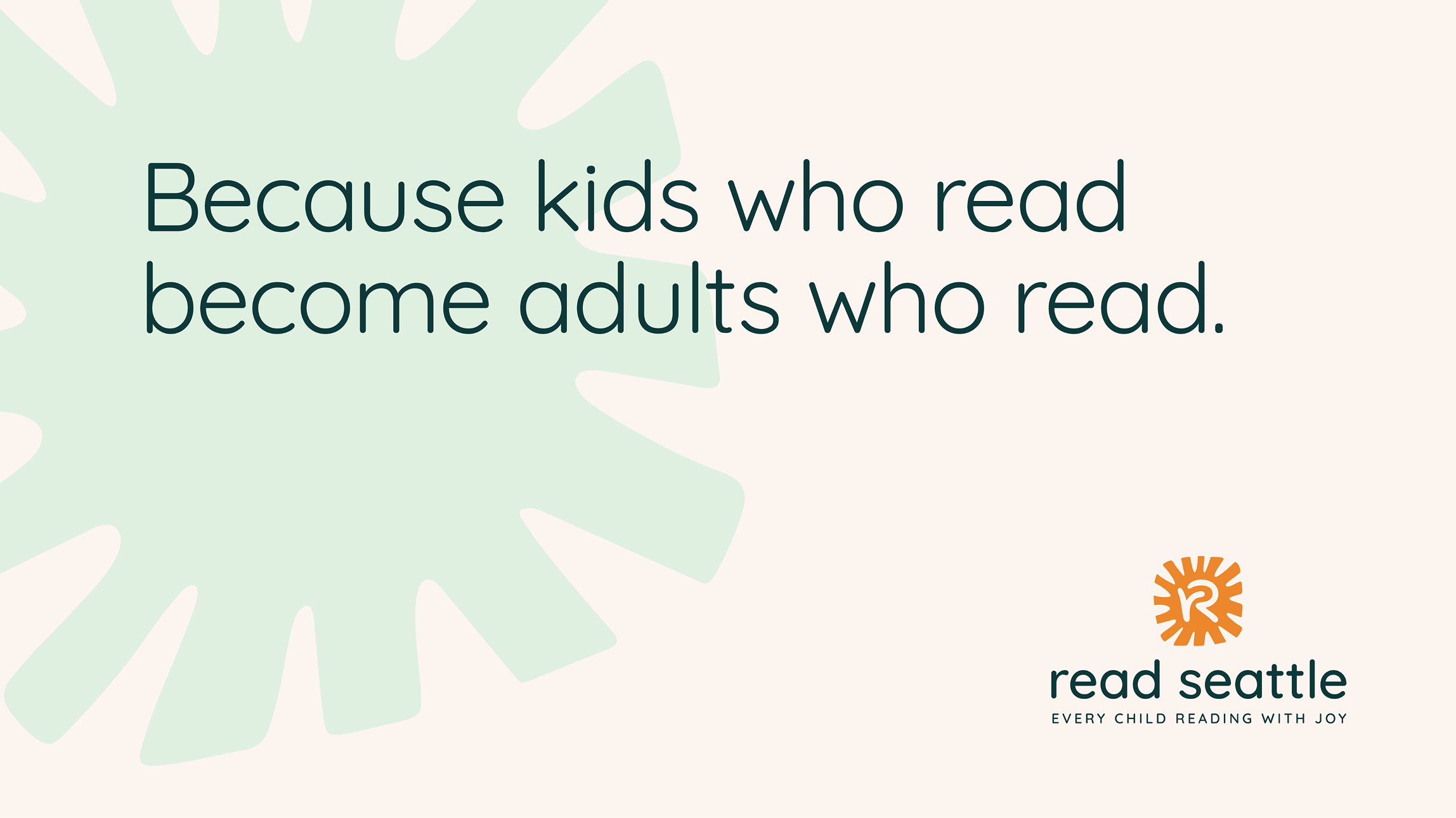
The logo concept grew from a simple idea — kids who read become adults who read. The lowercase r and uppercase R symbolize that transformation: the journey from early learning to lifelong literacy. The design captures growth and confidence while keeping the tone playful, modern, and inclusive. Paired with a bright, approachable visual system, it becomes a reminder that every reader starts small — and every story begins with one letter.